Dark Horse Coffee
Labeling San Diego’s Favorite Cold Brew
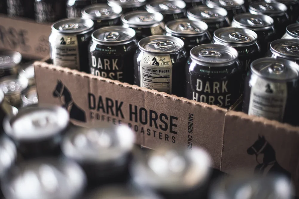
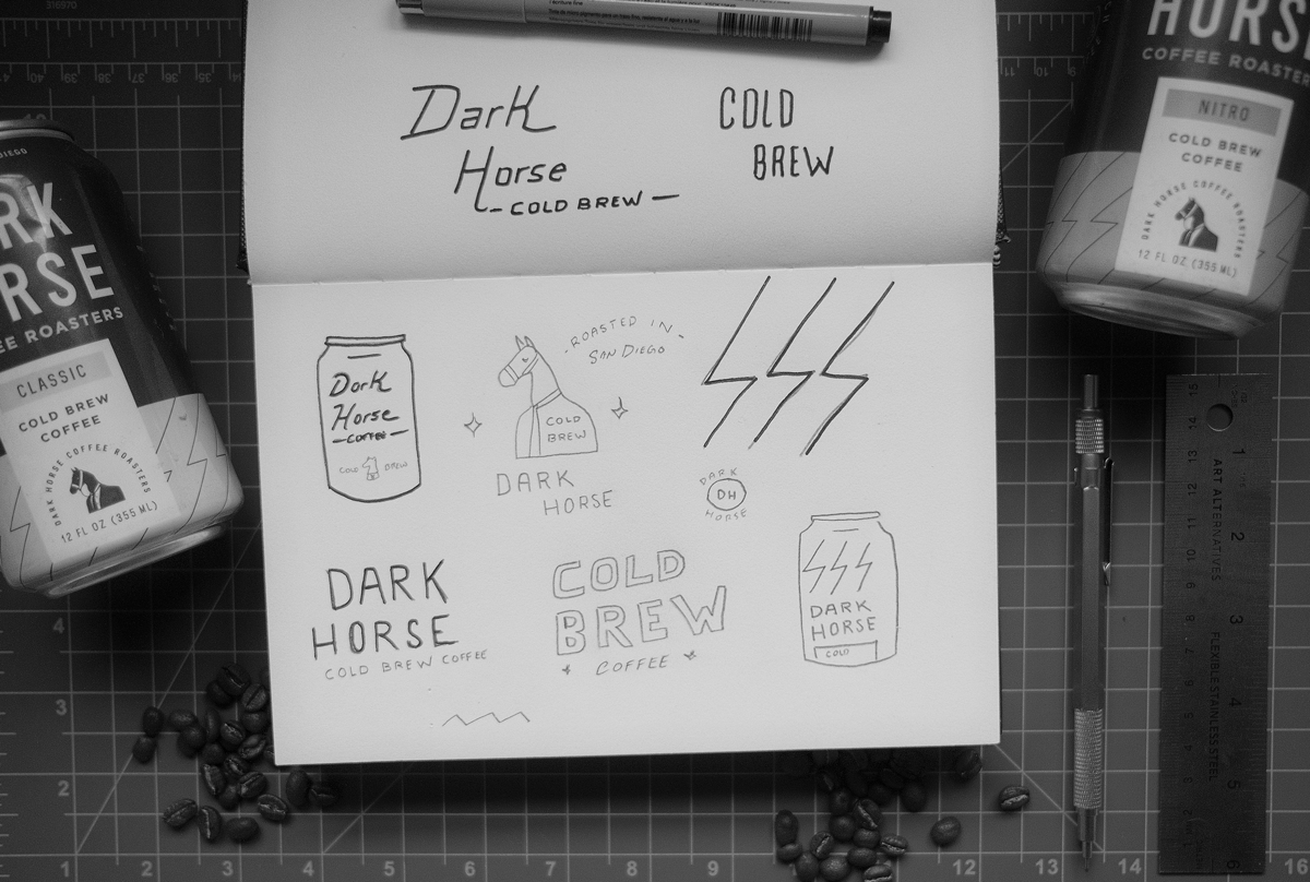
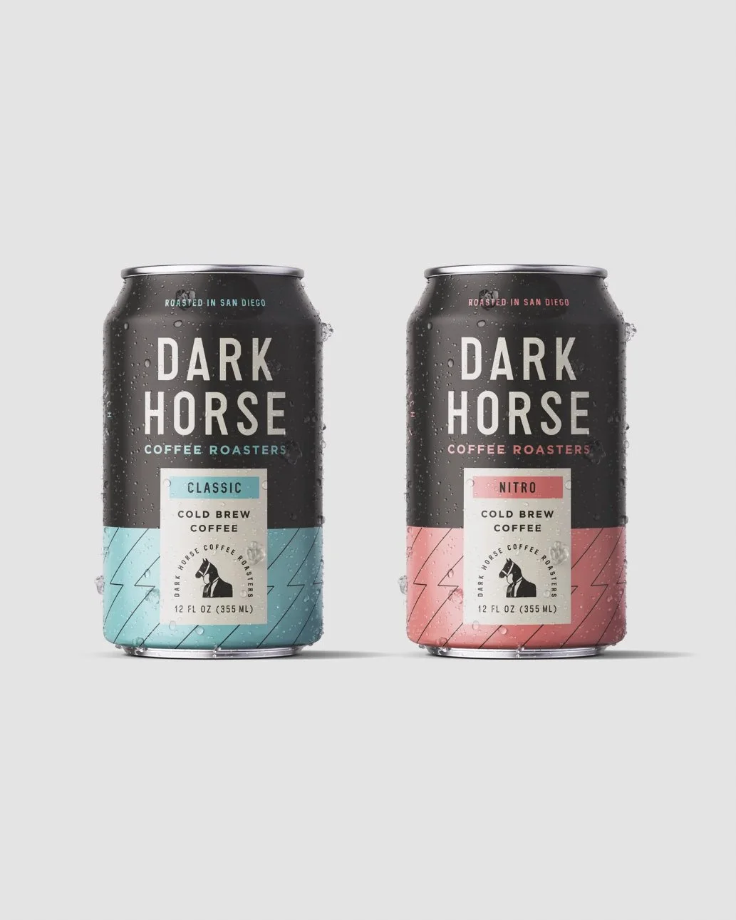
Dark Horse Coffee, a San Diego-based favorite of mine, tasked me with designing their cold brew line. The goal was to create packaging that stood out on shelves, captured the essence of each flavor, and reflected the vibrant, independent spirit of the brand
Role
Designer
Scope
- Packaging Design
- Branding

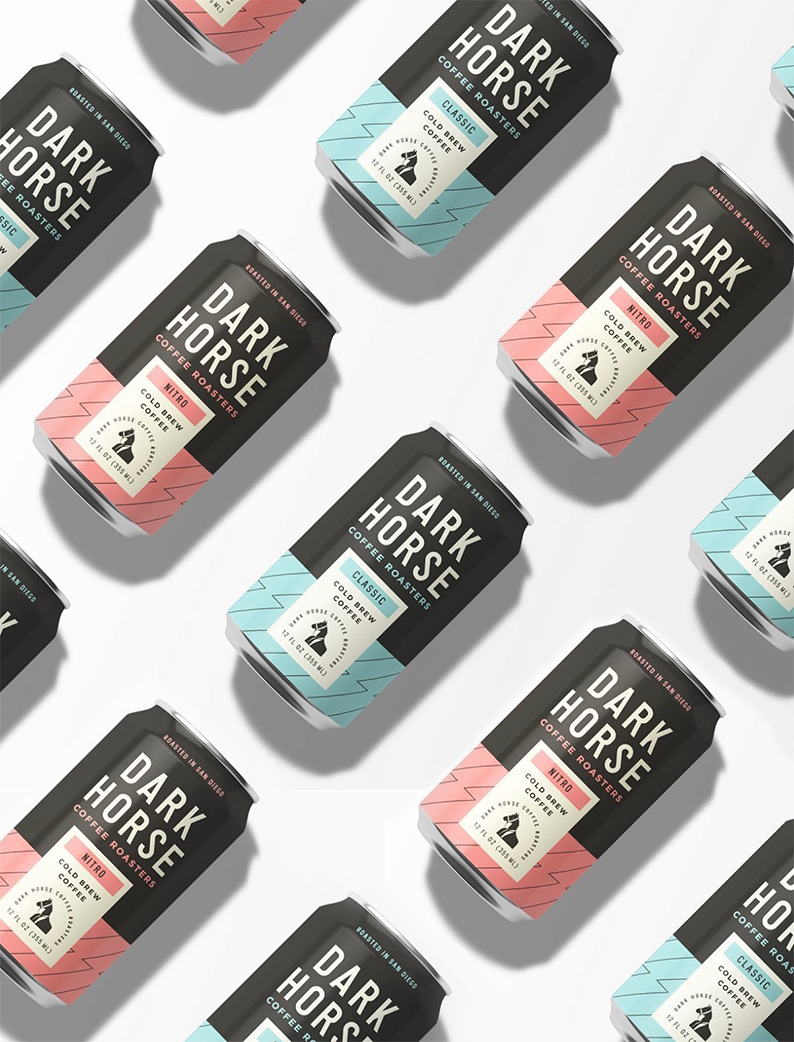
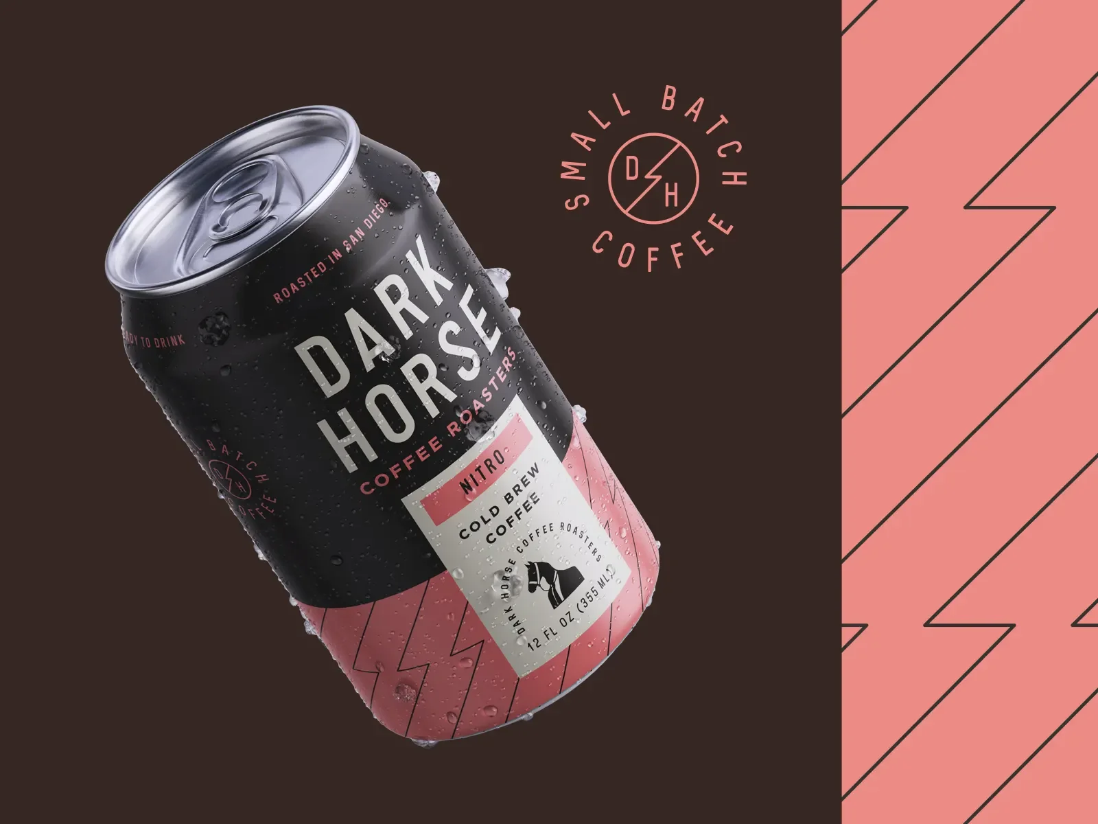
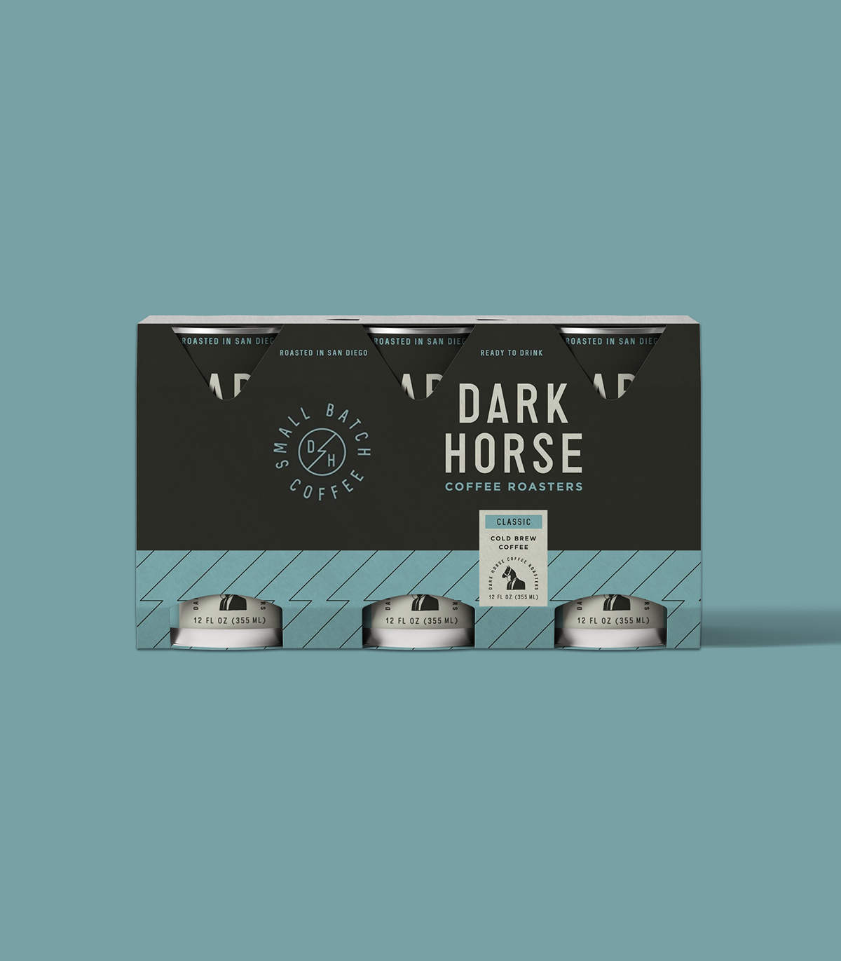
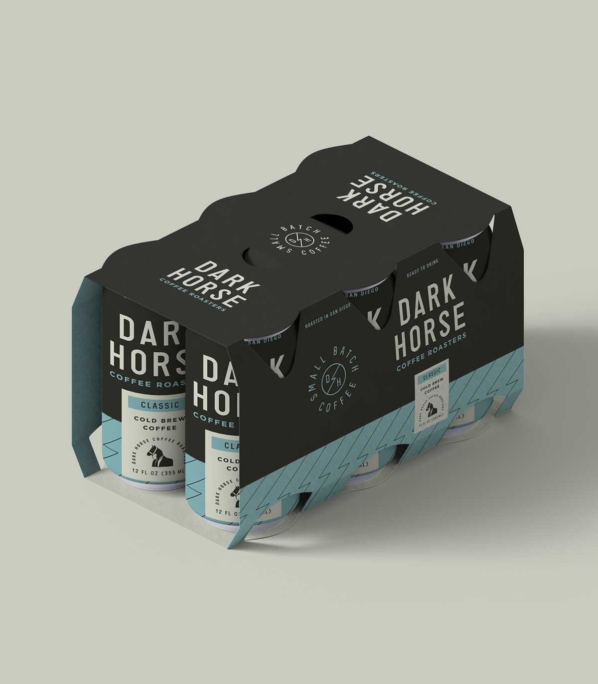
The color palette strikes a balance between boldness and restraint, combining deep, grounding neutrals with soft, unexpected accents. Adams Teal anchors the classic Cold Brew, while Nitro Salmon sets the Nitro Cold Brew apart.
Colors
Designed for Instant Recognition
Dark Horse Coffee is known for its quirky, free-spirited personality, but on shelf, it needed some clarity. The can design introduces a clean, repeatable template that brings instant recognition, while still leaving room for color, variation, and character.
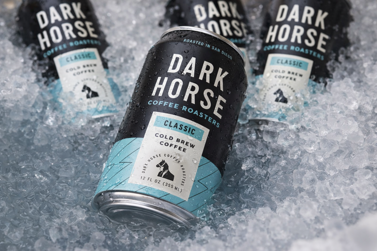
This packaging rebrand helped Dark Horse Cold Brew feel like itself again, bold, confident, and easy to spot. It turned the cans into something people actually notice (and pick up), and gave the brand fresh momentum.
A bold new look